Commentary
How should we present the epidemic curve for COVID-19?
Jean-Paul R. Soucy1, Sarah A. Buchan2, Kevin A. Brown2
Published online: November 15, 2021
1Division of Epidemiology, Dalla Lana School of Public Health, University of Toronto
2Public Health Ontario
Corresponding Author: Jean-Paul R. Soucy, email jeanpaul.soucy@mail.utoronto.ca
DOI: 10.26443/mjm.v20i2.901
Abstract
Epidemic curves are used by decision makers and the public to infer the trajectory of the COVID-19 pandemic and to understand the appropriateness of response measures. Symptom onset date is commonly used to date incident cases on the epidemic curve in public health reports and dashboards; however, third-party trackers date cases by the date they were publicly reported by the public health authority. These two curves create very different impressions of epidemic progression. On April 1, 2020, the epidemic curve based on public reporting date for Ontario, Canada showed an accelerating epidemic, whereas the curve based on a proxy variable for symptom onset date showed a rapidly declining epidemic. This illusory downward trend is a feature of epidemic curves anchored using date variables earlier in time than the date a case was publicly reported, such as the symptom onset date. Delays between the onset of symptoms and the detection of a case by the public health authority mean that recent days will always have incomplete case data, creating a downward bias. Public reporting date is not subject to this bias and can be used to visualize real-time epidemic curves meant to inform the public and decision makers.
Tags: Epidemics, COVID-19, SARS-CoV-2, Communicable Diseases, Epidemiology
Introduction
Epidemic curves are used to infer the current trajectory of the COVID-19 pandemic and to inform policy surrounding the COVID-19 response, including physical distancing measures, as well as shaping public perception of their necessity. When constructing epidemic curves, there are a variety of ways to date incident cases, such as by the symptom onset date or the date the case was publicly reported. Given the inevitable delays between when infections occur and when infections are detected and reported as cases, it is critical that the epidemic trajectory be communicated as quickly and as accurately as possible. The method selected to date incident cases for epidemic curves produced in real-time (rather than retrospectively, after the outbreak has ended) can profoundly alter the impression of the trajectory of the epidemic. In this analysis, we will demonstrate that epidemic curves based on symptom onset date (or a proxy thereof), as commonly presented by public health authorities across the world, are affected by an optimistic bias regarding the trajectory of COVID-19. The slopes of these curves will always be biased downwards, regardless of the epidemic’s true trajectory.
What are epidemic curves?
Epidemic curves show the trend in the incidence of a disease in a population through time (1) and are a mainstay of outbreak investigations and epidemiological analyses. A key feature of epidemic curves is that they are generally descriptive and can be constructed in numerous different ways, such as through the choices of case definition, subpopulations, or the method of dating incident cases. This contrasts with mathematical models such as the classic susceptible-infected-recovered model of Kermack and McKendrick (2), which are prescriptive, embedding assumptions and parameters regarding disease fundamentals. Epidemic curves date back to William Farr’s investigation of mortality during the 1848–1849 cholera epidemic in England. (3) Epidemic curves may provide clues about the characteristics of novel diseases. For example, the epidemic curve of the previously unknown Legionnaires’ disease showed cases tightly clustered in time, suggesting a common environmental source. This source was ultimately identified as the air conditioning of the hotel hosting the Pennsylvania American Legion convention. (4)
Epidemic curves have attained newfound prominence during the COVID-19 pandemic. Early public health messaging focused on “flattening the curve”—referring to the epidemic curve—so that the daily number of new infections did not overwhelm the capacity of the healthcare system. (5) More recently, epidemic curves have been used to guide decision makers in the further loosening or tightening of restrictions and to monitor the effects of these decisions on the trajectories of localized epidemics. Consequently, representations of the epidemic curve are prominent in public health and media reports and dashboards. (6–10) This fact makes the manner in which these curves are presented to the public all the more important.
The ideal epidemic curve would plot incident cases of disease based on the date of infection (on the x-axis), as this represents the true epidemiology of an infectious disease. However, date of infection is rarely known with certainty and is not available in real time, as the case must first be identified by public health authorities. Thus, in practice, dates following the date of infection are used to date incident cases. These dates include symptom onset date, sample collection date, laboratory testing date, and public reporting date.
Public health authorities commonly publish real-time epidemic curves using the date of symptom onset, with the logic that it is the closest measurable date to the date of infection (e.g., the Public Health Agency of Canada in their daily epidemiology update (6)). Third-party trackers such as those run by Johns Hopkins University (8), The COVID-19 Tracking Project (11), and the COVID-19 Canada Open Data Working Group (12) primarily use public reporting date, in part because more detailed date variables are not always available. These two dating methods produce very different epidemic curves, which can strongly affect the perceived trajectory of COVID-19 cases for reasons that will be explored in the subsequent section.
Why does the choice of epidemic curve matter?
Public health surveillance systems are continuously updated as new information becomes available. A case is entered into the system after the public health authority receives the result from the laboratory, after which a case investigation begins, and the data are publicly reported. Over the subsequent hours, days, and weeks, additional information may be entered and previous information may be revised. These revisions may include the date the individual developed symptoms, if at all.
The illusory downward trend
Real-time epidemic curves based on symptom onset date are subject to an illusory downward trend in the days closest to the present day. The cause of this trend is delayed reporting: cases detected today will usually have symptom onset dates days or even weeks prior to the current date. As a result, recent days will always have incomplete case data, creating an ever-present but illusory downward trend. A simple illustration of this phenomenon is shown in Figure 1, which assumes a fixed 4-day delay between symptom onset and case identification. The most recent 4 days on the epidemic curve plotted by symptom onset date have no cases because these cases have not yet been identified. This artifact does not occur when plotting by public reporting date because cases are added to the curve on the date they are identified by the public health authority.
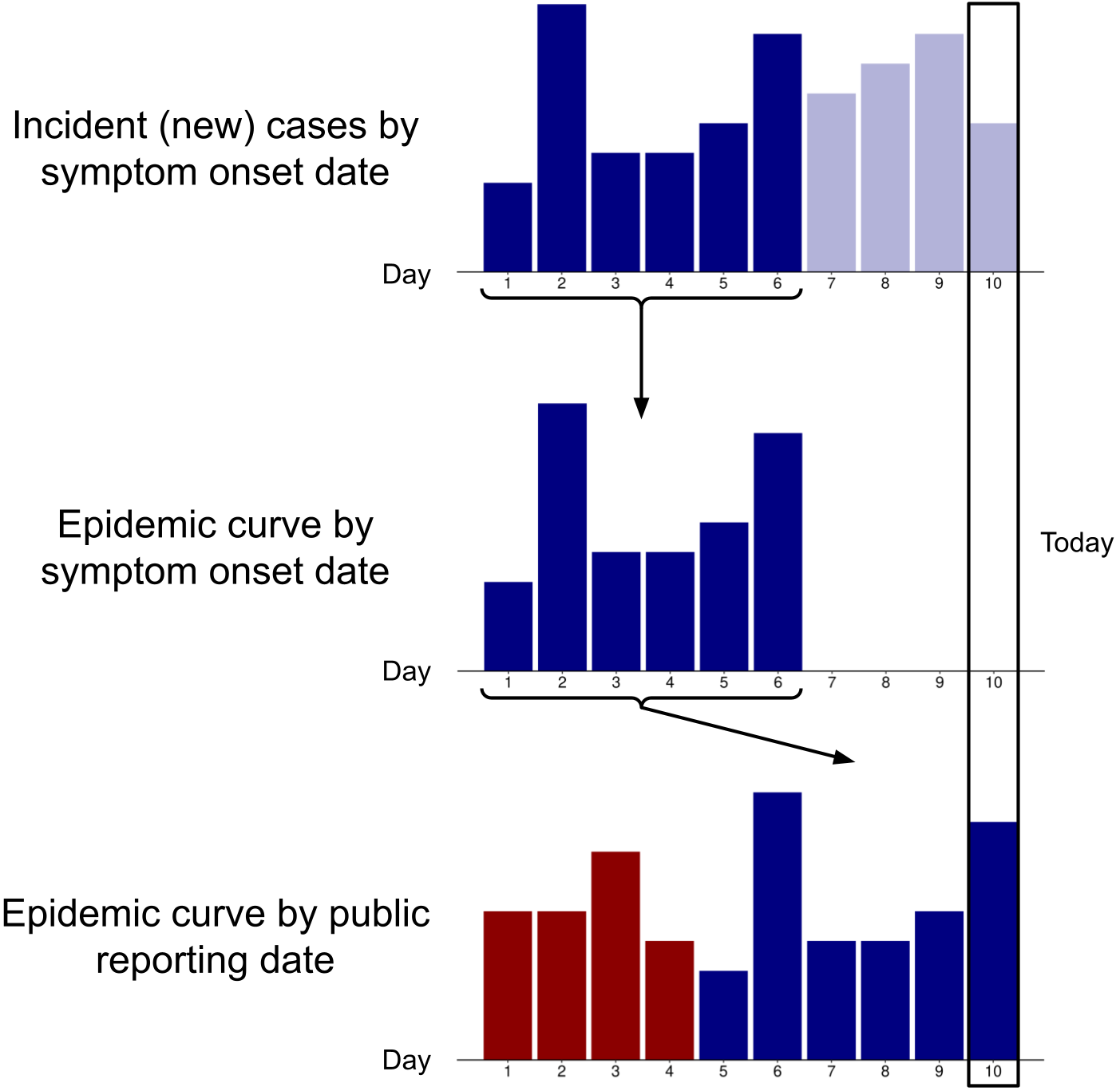
Transparent blue bars indicate symptomatic cases that have not yet been identified; red bars indicate cases that became symptomatic prior to day 1. Day 10 represents the present date.
This illusory trend is exacerbated by delays in administering tests, processing tests, and communicating test results to public health authorities, since the symptom onset date will be proportionately further back in time relative to the date the case is identified by the public health authority. Consequently, a region overwhelmed by new cases will see an even more pronounced downward bias. However, this bias is not solely a technical issue but also an issue of natural history, human behaviour, and healthcare systems. Consider the following scenario: tests are processed instantaneously at the time of collection, results are immediately transmitted to the public health surveillance system, and symptom onset date is ascertained perfectly in real time. Epidemic curves based on symptom onset date would still show an illusory downward trend because of inevitable delays and variability between when an individual first experiences symptoms and when they seek and receive a test.
Symptom onset date has other practical limitations for constructing real-time epidemic curves due to delays and difficulties in the determination of symptom onset. Delays can occur because it may take several days to conclude a case investigation (particularly during periods of high case load). (13) Recall issues and patient incapacitation or death also complicate measurement. For asymptomatic cases, a symptom onset date cannot be assigned at all.
An example using epidemic data from Ontario, Canada
To circumvent the issues inherent to measuring the date of symptom onset, public health surveillance systems in Canada generally use a proxy variable for this date called the “episode date”. If the symptom onset date is absent, the episode date is defined as the earliest available date in the following hierarchy: specimen collection date, laboratory testing date, and the date that the public health authority received the report from the laboratory. (14) Unless the earliest date (either symptom onset date or sample collection date, if the former cannot be ascertained) is the same as the date that the case is publicly reported, all cases will appear on the epidemic curve on a date that is earlier than the date on which they were publicly reported. During the early pandemic period in Ontario, the date of symptom onset was generally the last date entered into the system (if it was entered at all). As a result, newer cases would be progressively pushed back to earlier dates on the epidemic curve as the episode date was updated, culminating with the true symptom onset date (if it could be ascertained). This process led to more recent days on the epidemic curve having fewer cases—creating the illusory downward trend.
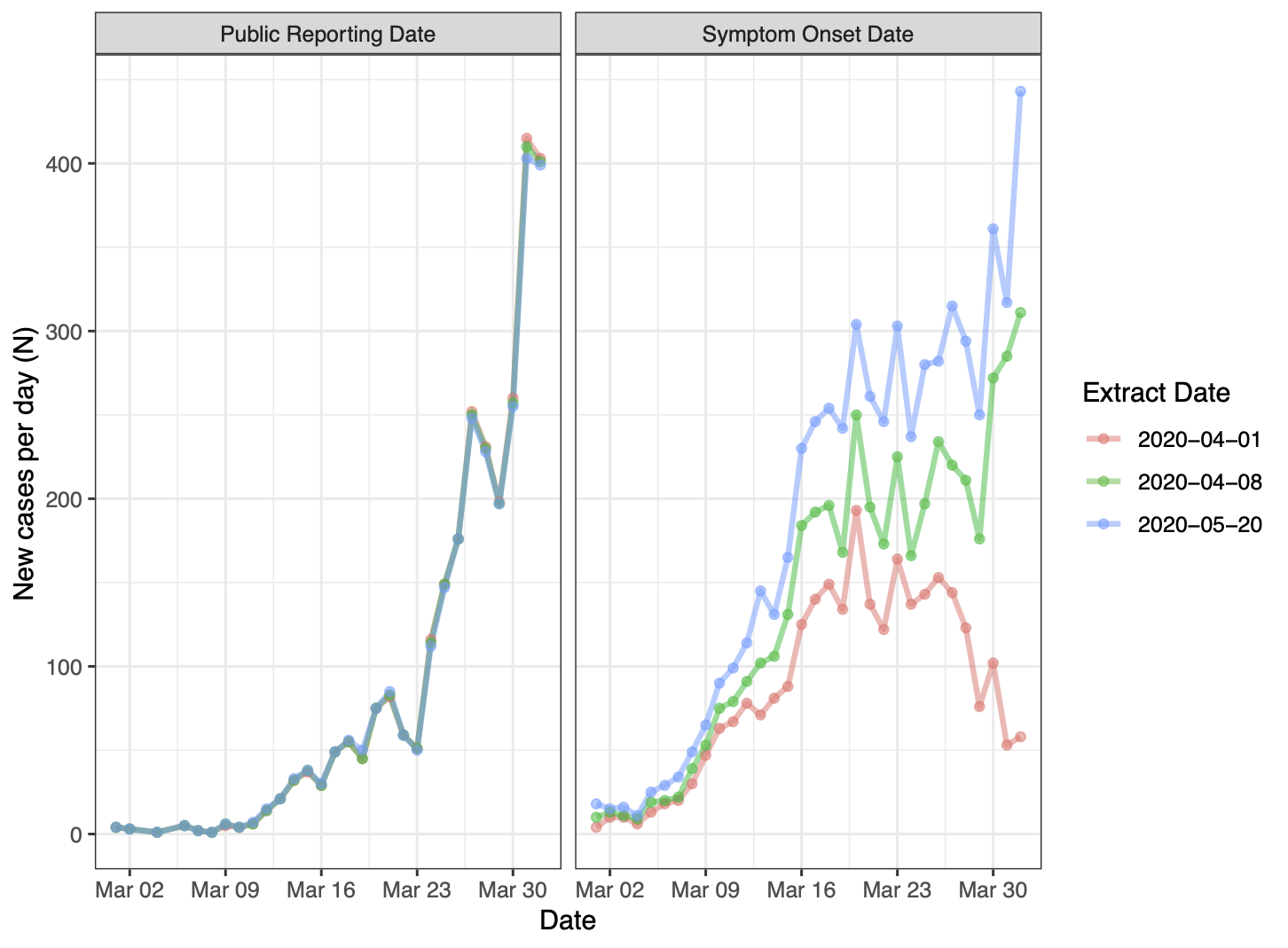
The pink curve represents the real-time epidemic curve, while the green and blue curves are those observed 1 and 7 weeks later, respectively. Note that “public reporting date” in this figure refers to the date the case was entered into the provincial surveillance system.
Consider Figure 2 which displays epidemic curves for COVID-19 in Ontario, Canada from March 1, 2020 to April 1, 2020 plotted by different date variables: episode date (the proxy for symptom onset date) and public reporting date. The three curves for each date variable correspond to datasets extracted on three different dates: April 1 (pink, the real-time dataset), April 8 (green, 1 week later) and May 20 (blue, 7 weeks later, after which edits to cases from March have largely ceased). The real-time dataset contains 2,793 cumulative cases from January to April 1. However, the cumulative number of cases up to April 1 in the May 20 data extract differs greatly according to which variable is used to date cases. Using public reporting date, the cumulative number of cases is 2,772, nearly unchanged from the real-time dataset. This is expected because cases dated by public reporting date should only change to correct data entry errors and to remove duplicates and individuals no longer meeting the case definition. In contrast, the number of cumulative cases by episode date in this data extract is 5,922, more than double that of the real-time dataset. This is because the real-time dataset is highly incomplete: many cases reported at the end of March had symptom onset dates in mid-March, and most cases with symptom onset dates in late March were not identified and reported until April.
The real-time epidemic curve that is plotted by symptom onset date shows a pronounced illusory downward trend. This artifact creates the impression that incidence peaked in mid-March and is rapidly declining toward the end of the month. The later data extracts correct this optimistic bias: daily incidence was climbing throughout the entire month of March. On the other hand, the real-time epidemic curve based on public reporting date reliably communicated the trend of increasing incidence throughout the month of March.
How are epidemic curves being used during COVID-19?
Epidemic curves for COVID-19 that are based on symptom onset date (or a proxy thereof) are commonly included in reports and dashboards produced by public health organizations around the globe. (6,9,15–20) In these figures, caveats are often given in the form of a shaded area on the graph covering recent dates, with text indicating that recent cases may not yet be reported.
When epidemic curves are used by decision makers and members of the public to assess disease trajectory amid an outbreak, curves plotted by symptom onset date can be misleading. This possibility is not merely theoretical: these curves have been misinterpreted by public officials to justify loosening public health measures in at least two American states, Georgia (21) and Iowa (22). This phenomenon of delayed reporting and incomplete incidence data is well known in the realms of infectious disease modelling (23,24), HIV/AIDS research (25) and of mortality statistics, where the manual coding of deaths often results in a lag before these deaths are counted in official datasets (26). This issue has also been discussed in the context of charting COVID-19 deaths. (27,28) Never has this phenomenon been so consequential as it is in our present moment.
Conclusion
Real-time epidemic curves are useful for visualizing the trajectory of the COVID-19 pandemic. Epidemic curves based on symptom onset date are important for understanding the epidemiology of an outbreak in retrospect because they form an approximation of the infection curve. However, reporting delays mean that the most recent days of data on an epidemic curve plotted by symptom onset date will always be incomplete, and this creates an illusory trend of falling case numbers. This artifact limits the usefulness of epidemic curves by symptom onset date for communicating the disease trajectory in real time. In contrast, curves that are constructed using the date a case was publicly reported do not suffer from this distortion.
The COVID-19 pandemic is not over. As the virus continues to sweep across the globe and many regions experience persistently high caseloads, it is essential that epidemic curves reliably communicate the present trajectory of detected cases. The public reporting date can be used to visualize real-time epidemic curves meant to inform the public and decision makers.
References
- Rosenberg PS. Epidemic Curve. In: Wiley StatsRef: Statistics Reference Online. Hoboken, NJ: John Wiley & Sons; 2015. Available from: https://doi.org/10.1002/9781118445112.stat05266.pub2
- Kermack WO, McKendrick AG, Walker GT. A contribution to the mathematical theory of epidemics. Proceedings of the Royal Society of London Series A, Containing Papers of a Mathematical and Physical Character. 1927 Aug 1;115(772):700–21. Available from: https://doi.org/10.1098/rspa.1927.0118
- Farr W. Report on the mortality of cholera in England, 1848-49. London: Her Majesty’s Stationary Office; 1852.
- Fraser DW, Tsai TR, Orenstein W, Parkin WE, Beecham HJ, Sharrar RG, et al. Legionnaires’ Disease: Description of an Epidemic of Pneumonia. N Engl J Med. 1977 Dec 1 [cited 2020 Oct 23];297(22):1189–97. Available from: https://doi.org/10.1056/NEJM197712012972201
- Jones DS, Helmreich S. The Shape of Epidemics. Boston Review. 2020 Jun 26 [cited 2020 Sep 21]. Available from: https://bostonreview.net/science-nature/david-s-jones-stefan-helmreich-shape-epidemics
- Public Health Agency of Canada. COVID-19 daily epidemiology update. 2021 [cited 2021 Sep 19]. Available from: https://health-infobase.canada.ca/covid-19/epidemiological-summary-covid-19-cases.html
- Government of the United Kingdom. Coronavirus (COVID-19) in the UK: Cases. 2020 [cited 2020 Sep 21]. Available from: https://coronavirus.data.gov.uk/cases
- Dong E, Du H, Gardner L. An interactive web-based dashboard to track COVID-19 in real time. The Lancet Infectious Diseases. 2021 May [cited 2020 Apr 3];20(5):533–4. Available from: https://doi.org/10.1016/S1473-3099(20)30120-1
- State of Michigan. Coronavirus - Michigan Data. 2021 [cited 2021 Jan 16]. Available from: https://www.michigan.gov/coronavirus/0,9753,7-406-98163_98173---,00.html
- CTV News. Tracking every case of COVID-19 in Canada. CTV News. 2021 Jan 16 [cited 2021 Jan 16]. Available from: https://www.ctvnews.ca/health/coronavirus/tracking-every-case-of-covid-19-in-canada-1.4852102
- The COVID Tracking Project. The COVID Tracking Project. 2020 [cited 2020 Sep 21]. Available from: https://covidtracking.com/
- Berry I, Soucy J-PR, Tuite A, Fisman D. Open access epidemiologic data and an interactive dashboard to monitor the COVID-19 outbreak in Canada. CMAJ. 2020 Apr 14 [cited 2020 Apr 13];192(15):E420. Available from: https://doi.org/10.1503/cmaj.75262
- Ontario Agency for Health Protection and Promotion (Public Health Ontario). COVID-19 regional incidence and time to case notification in Ontario. Toronto, Canada: Queen’s Printer for Ontario; 2020 [cited 2020 Sep 21]. Available from: https://www.publichealthontario.ca/-/media/documents/ncov/epi/covid-19-regional-epi-summary-report.pdf?la=en
- Ontario Agency for Health Protection and Promotion (Public Health Ontario). iPHIS User Guide: Enteric and Zoonotic Diseases. Toronto, Canada: Queen’s Printer for Ontario; 2019 [cited 2020 Sep 21]. Available from: https://www.publichealthontario.ca/-/media/documents/i/2019/iphis-user-guide-enteric-zoonotic.pdf?la=en
- City of Toronto. COVID-19: Status of Cases in Toronto. City of Toronto; 2020 [cited 2020 Sep 21]. Available from: https://www.toronto.ca/home/covid-19/covid-19-latest-city-of-toronto-news/covid-19-status-of-cases-in-toronto/
- BC Centre for Disease Control. British Columbia Weekly COVID-19 Surveillance Report: September 11–September 17, 2020. 2020 [cited 2020 Sep 21]. Available from: http://www.bccdc.ca/Health-Info-Site/Documents/BC_Surveillance_Summary_Sept_17_2020.pdf
- Mississippi State Department of Health. Coronavirus COVID-19. 2021 [cited 2021 Jan 7]. Available from: https://msdh.ms.gov/coronavirus
- Ohio Department of Health. COVID-19 Dashboard. 2021 [cited 2021 Jan 16]. Available from: https://coronavirus.ohio.gov/wps/portal/gov/covid-19/dashboards/overview
- Ottawa Public Health. Daily COVID-19 Dashboard. 2020 [cited 2020 Sep 21]. Available from: https://www.ottawapublichealth.ca/en/reports-research-and-statistics/daily-covid19-dashboard.aspx
- San Diego County. Daily COVID-19 Data Update 2021-1-6. 2021 [cited 2021 Jan 7]. Available from: https://www.sandiegocounty.gov/content/dam/sdc/hhsa/programs/phs/Epidemiology/COVID-19_Daily_Status_Update.pdf
- Wooten N. COVID-19 data from Georgia’s Department of Health could be ‘misleading,’ experts say. Ledger Enquirer. 2020 May 5 [cited 2020 Sep 22]. Available from: https://www.ledger-enquirer.com/news/coronavirus/article242416536.html
- Rodriguez B. University of Iowa researchers warn Òa second wave of infections is likelyÓ if COVID-19 prevention efforts are lifted. Des Moines Register. 2020 April 28 [cited 2020 Sep 22]. Available from: https://www.desmoinesregister.com/story/news/health/2020/04/28/university-iowa-researchers-warn-kim-reynolds-administration-second-coronavirus-wave/3040849001/
- Bacchetti P. Back-Calculation. In: Wiley StatsRef: Statistics Reference Online. Hoboken, NJ: John Wiley & Sons; 2014. Available from: https://doi.org/10.1002/9781118445112.stat05058
- Finger F, Funk S, White K, Siddiqui MR, Edmunds WJ, Kucharski AJ. Real-time analysis of the diphtheria outbreak in forcibly displaced Myanmar nationals in Bangladesh. BMC Medicine. 2019 Mar 12 [cited 2020 Jul 12];17(1):58. Available from: https://doi.org/10.1186/s12916-019-1288-7
- Brookmeyer R, Gail MH. Minimum Size of the Acquired Immunodeficiency Syndrome (AIDS) Epidemic in the United States. The Lancet. 1986 Dec 6 [cited 2021 Sep 20];328(8519):1320–2. Available from: https://doi.org/10.1016/s0140-6736(86)91444-3
- Centers for Disease Control and Prevention. Technical Notes: Provisional Death Counts for Coronavirus Disease (COVID-19). 2020 [cited 2020 Sep 21]. Available from: https://www.cdc.gov/nchs/nvss/vsrr/covid19/tech_notes.htm
- Walker P. Is There a Right Way to Chart COVID-19 Deaths Over Time? The COVID Tracking Project. 2020 [cited 2020 Sep 21]. Available from: https://covidtracking.com/blog/is-there-a-right-way-to-chart-covid-19-deaths-over-time
- Mathieu E. Why do COVID-19 deaths in Sweden always appear to decrease in the last 10 days? Our World in Data. 2020 [cited 2021 Jan 7]. Available from: https://ourworldindata.org/covid-sweden-death-reporting

This work is licensed under a Creative Commons Attribution-NonCommercial-ShareAlike 4.0 International License.